12 Plot populations and samples
12.1 ⭐️Overview
This chapter is about plotting out populations (usually of people) and samples (usually of people). This are mostly useful for teaching and training purposes
12.2 🌎Useful websites
The note on Contingency Tables
Stack Overflow: How to randomly scatter points inside a circle with ggplot, without clustering around the center? (In case you want to distribute them randomly)
12.4 🔢Simulate population data
I think you have to make it on a grid.
Add exposed vs. unexposed
Half exposed and half unexposed. If exposed, half have outcome. If unexposed, 10% have outcome.
# Helper function for sampling No and Yes
# sample_ny <- function(n = 100, prob_y = 0.5) {
#   set.seed(123)
#   s <- sample(c("No", "Yes"), n, TRUE, c(1 - prob_y, prob_y))
#   s <- factor(s)
#   s
# }

# For testing
# sample_ny(prob_y = 0.1)
# Helper function for sampling No and Yes - Simplified
sample_ny <- function(n = 100, prob_y = 0.5) {
sample(c("No", "Yes"), n, TRUE, c(1 - prob_y, prob_y))
}
# For testing
# sample_ny(prob_y = 0.1)set.seed(123)
pop$exposed <- sample_ny()
pop$outcome <- NA_character_
pop$outcome[pop$exposed == "Yes"] <- sample_ny(n = sum(pop$exposed == "Yes"), prob_y = 0.5)
pop$outcome[pop$exposed == "No"] <- sample_ny(n = sum(pop$exposed == "No"), prob_y = 0.1)## # A tibble: 4 × 3
## exposed outcome n
## <chr> <chr> <int>
## 1 No No 43
## 2 No Yes 4
## 3 Yes No 26
## 4 Yes Yes 2712.5 Plot
# Pull orange and blue colors from templates package
u_orange <- filter(my_colors, description == "University Orange") %>% pull(hex)
u_blue <- filter(my_colors, description == "University Blue") %>% pull(hex)ggplot(pop, aes(x, y)) +
geom_point(size = 5, aes(color = exposed, shape = outcome)) +
scale_color_manual("Exposed", values = c(u_blue, u_orange)) +
theme(
panel.background = element_blank(),
axis.title = element_blank(),
axis.text = element_blank(),
axis.ticks = element_blank()
)
12.5.1 Combine legends
To combine the legend, we need to have a single variable with exposure and outcome information.
pop <- pop %>%
  mutate(
    e_o = case_when(
      exposed == "Yes" & outcome == "Yes" ~ "a",
      exposed == "Yes" & outcome == "No" ~ "b",
      exposed == "No" & outcome == "Yes" ~ "c",
      exposed == "No" & outcome == "No" ~ "d"
    ),
    e_o_f = factor(
      e_o, c("a", "b", "c", "d"),
      c(
        "Exposed - Outcome", "Exposed - No Outcome",
        "Not exposed - Outcome", "Not exposed - No outcome"
      )
    )
)ggplot(pop, aes(x, y, color = e_o_f, shape = e_o_f)) +
geom_point(size = 5) +
scale_color_manual("Exposure-Outcome", values = c(u_orange, u_orange, u_blue, u_blue)) +
scale_shape_manual("Exposure-Outcome", values = c(tri, cir, tri, cir)) +
theme(
panel.background = element_blank(),
axis.title = element_blank(),
axis.text = element_blank(),
axis.ticks = element_blank()
)
12.5.2 Sample box
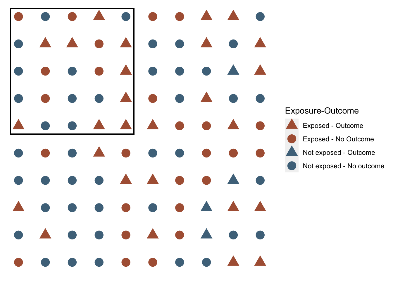
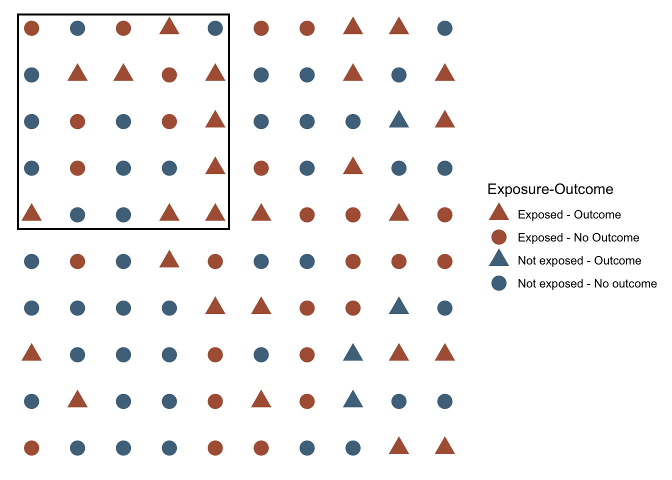
Sometimes I want to draw a box around a sample. For example, let’s draw a box around a 5x5 sample in the top right corner.
ggplot(pop, aes(x, y)) +
  geom_point(size = 5, aes(color = e_o_f, shape = e_o_f)) +
  # Draw sample box
  geom_rect(
    xmin = 0.7, xmax = 5.3, ymin = 5.7, ymax = 10.3,
    alpha = 0, color = "black"
  ) +
  scale_color_manual("Exposure-Outcome", values = c(u_orange, u_orange, u_blue, u_blue)) +
  scale_shape_manual("Exposure-Outcome", values = c(tri, cir, tri, cir)) +
  theme(
    panel.background = element_blank(),
    axis.title = element_blank(),
    axis.text = element_blank(),
    axis.ticks = element_blank()
  )
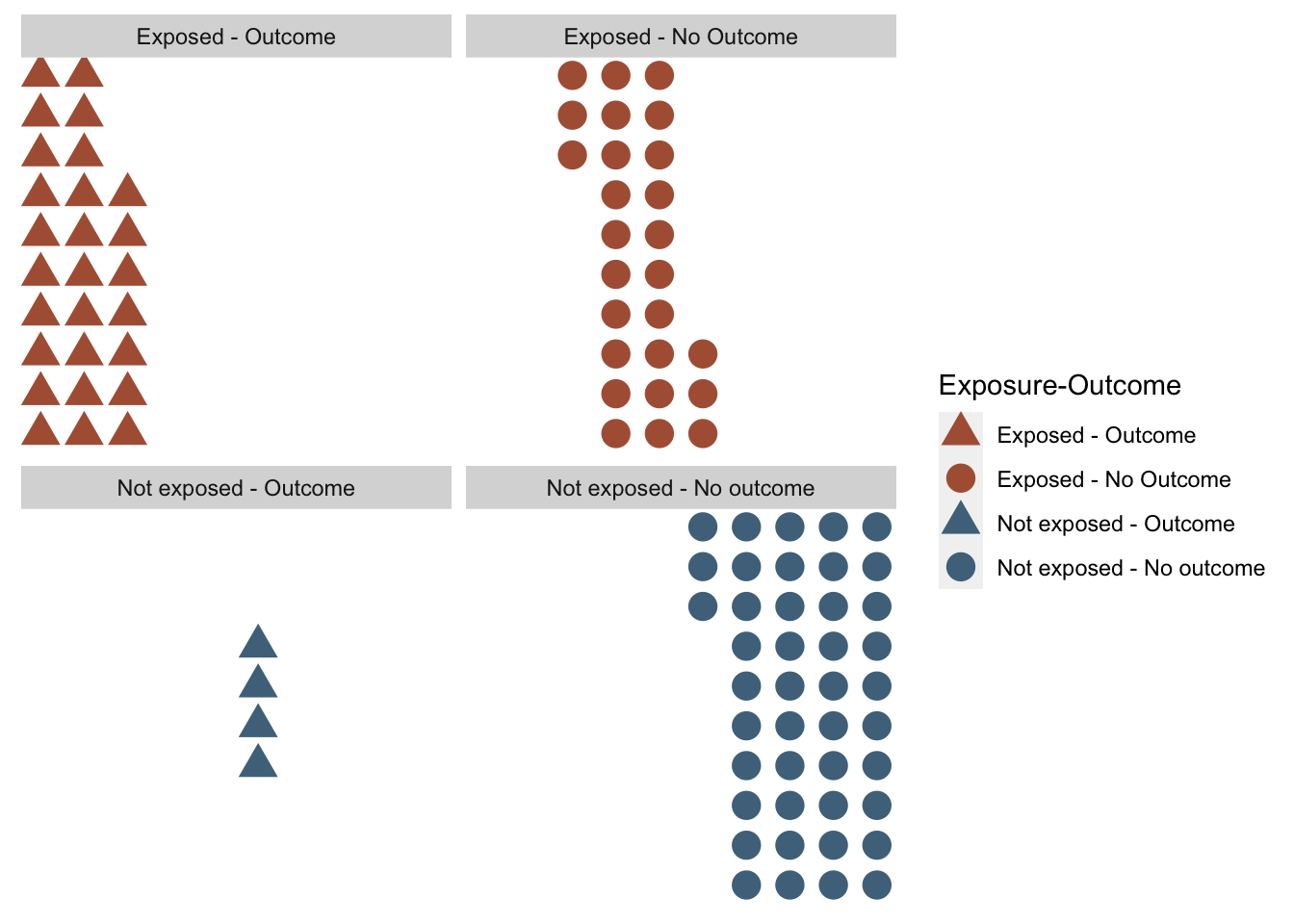
12.5.3 Align colors and shapes
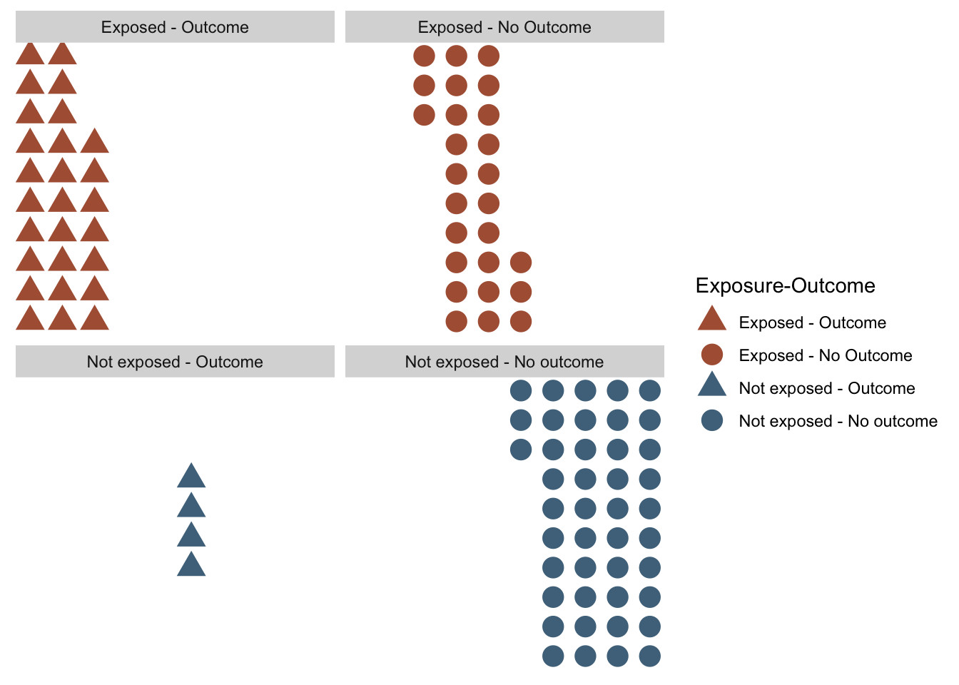
Sometimes I want the exposed-unexposed to be haphazardly spread around the plot like they are above. Sometimes, I want the exposed next to the exposed and the unexposed next to the unexposed.
pop_arrange <- pop %>%
  arrange(desc(exposed), desc(outcome)) %>%
  # Renumber the grid
  mutate(
    x = rep(1:10, each = 10),
    y = rep(1:10, 10)
)ggplot(pop_arrange, aes(x, y)) +
geom_point(size = 5, aes(color = e_o_f, shape = e_o_f)) +
scale_color_manual("Exposure-Outcome", values = c(u_orange, u_orange, u_blue, u_blue)) +
scale_shape_manual("Exposure-Outcome", values = c(tri, cir, tri, cir)) +
theme(
panel.background = element_blank(),
axis.title = element_blank(),
axis.text = element_blank(),
axis.ticks = element_blank()
)
Use facet to make them stand out even more clearly.
ggplot(pop_arrange, aes(x, y)) +
  geom_point(size = 5, aes(color = e_o_f, shape = e_o_f)) +
  scale_color_manual("Exposure-Outcome", values = c(u_orange, u_orange, u_blue, u_blue)) +
  scale_shape_manual("Exposure-Outcome", values = c(tri, cir, tri, cir)) +
  facet_wrap(vars(e_o_f))+
  theme(
    panel.background = element_blank(),
    axis.title = element_blank(),
    axis.text = element_blank(),
    axis.ticks = element_blank()
  )
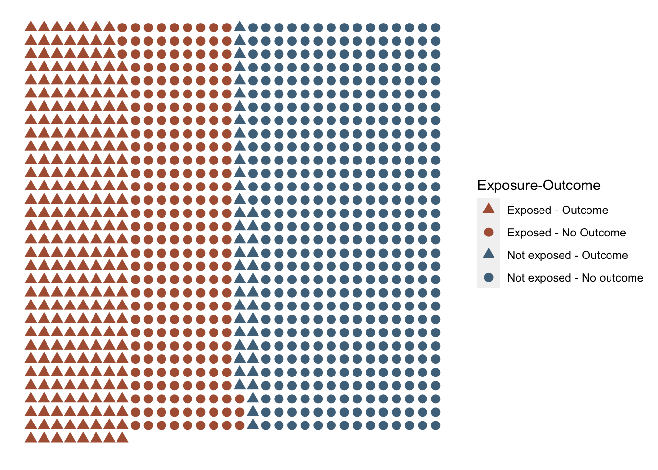
12.6 More helper functions
12.6.1 Create a pop of size x with e prop exposed and o prop with outcome
make_pop <- function(n_total = 100,
                     prob_exposed,
                     prob_outcome_exposed,
                     prob_outcome_unexposed,
                     arrange = FALSE) {
  # Figure out the smallest integer that will be at least size
  # n_total when multiplied by 2. The idea is to figure out the dimensions
  # for the closest thing I can get to a square given n_total
  n_sqrt <- sqrt(n_total)
  n_sqrt_ceiling <- ceiling(n_sqrt)
  drop <- n_sqrt_ceiling^2 - n_total

  # Make coordinates for grid of points
  pop <- expand_grid(
    x = seq(n_sqrt_ceiling),
    y = seq(n_sqrt_ceiling)
  )

  # Drop of n_sqrt is uneven. Drop from bottom right corner.
  # High x, low y.
  pop <- pop %>%
    arrange(desc(y)) %>%
    slice(1:(n() - drop)) %>%
    arrange(x, y)

  # I still want y to be base 1
  pop$y <- pop$y + (1 - min(pop$y))

  # Add exposed and unexposed
  # Helper function for sampling No and Yes - Simplified
  sample_ny <- function(n = 100, prob_y = 0.5) {
    sample(c("No", "Yes"), n, TRUE, c(1 - prob_y, prob_y))
  }

  # Add exposed
  pop$exposed <- sample_ny(n = n_total, prob_y = prob_exposed)

  # Add outcome
  pop$outcome <- NA_character_
  n_exp_y <- sum(pop$exposed == "Yes")
  n_exp_n <- sum(pop$exposed == "No")
  pop$outcome[pop$exposed == "Yes"] <- sample_ny(n_exp_y, prob_y = prob_outcome_exposed)
  pop$outcome[pop$exposed == "No"] <- sample_ny(n_exp_n, prob_y = prob_outcome_unexposed)

  # Add exposure-outcome group columns
  # To combine the legend, we need to have a single variable with exposure
  # and outcome information.
  pop <- pop %>%
    mutate(
      e_o = case_when(
        exposed == "Yes" & outcome == "Yes" ~ "a",
        exposed == "Yes" & outcome == "No" ~ "b",
        exposed == "No" & outcome == "Yes" ~ "c",
        exposed == "No" & outcome == "No" ~ "d"
      ),
      e_o_f = factor(
        e_o, c("a", "b", "c", "d"),
        c(
          "Exposed - Outcome", "Exposed - No Outcome",
          "Not exposed - Outcome", "Not exposed - No outcome"
        )
      )
    )

  # Arrange
  # Sometimes I want the exposed-unexposed to be haphazardly spread around the
  # plot. Sometimes, I want the exposed next to the exposed and the unexposed
  # next to the unexposed.
  if (arrange) {
    # Separate x and y from the rest of the data before arranging
    x_y <- select(pop, x, y)
    pop <- pop %>%
      select(-x, -y) %>%
      arrange(desc(exposed), desc(outcome))
    # Add x and y back
    pop <- bind_cols(x_y, pop)
  }

  # Return tibble
  pop
}

# For testing
# set.seed(123)
# make_pop(
#   n_total = 100,
#   prob_exposed = 0.5,
#   prob_outcome_exposed = 0.5,
#   prob_outcome_unexposed = 0.1,
#   arrange = FALSE
# )
12.6.2 Create a helper plot function
plot_pop <- function(.data, p_size = 5) {

  # Store shape codes
  cir <- 16
  tri <- 17

  # Create plot
  p <- ggplot(.data, aes(x, y, color = e_o_f, shape = e_o_f)) +
    geom_point(size = p_size) +
    scale_color_manual("Exposure-Outcome", values = c(u_orange, u_orange, u_blue, u_blue)) +
    scale_shape_manual("Exposure-Outcome", values = c(tri, cir, tri, cir)) +
    theme(
      panel.background = element_blank(),
      axis.title = element_blank(),
      axis.text = element_blank(),
      axis.ticks = element_blank()
    )

  # Return plot object
  p
}

# For testing
# pop_plot(pop, 5)
Test
set.seed(123)
pop <- make_pop(
  n_total = 1000,
  prob_exposed = 0.5,
  prob_outcome_exposed = 0.5,
  prob_outcome_unexposed = 0.1,
  arrange = TRUE
)

pop %>%
  plot_pop(p_size = 3)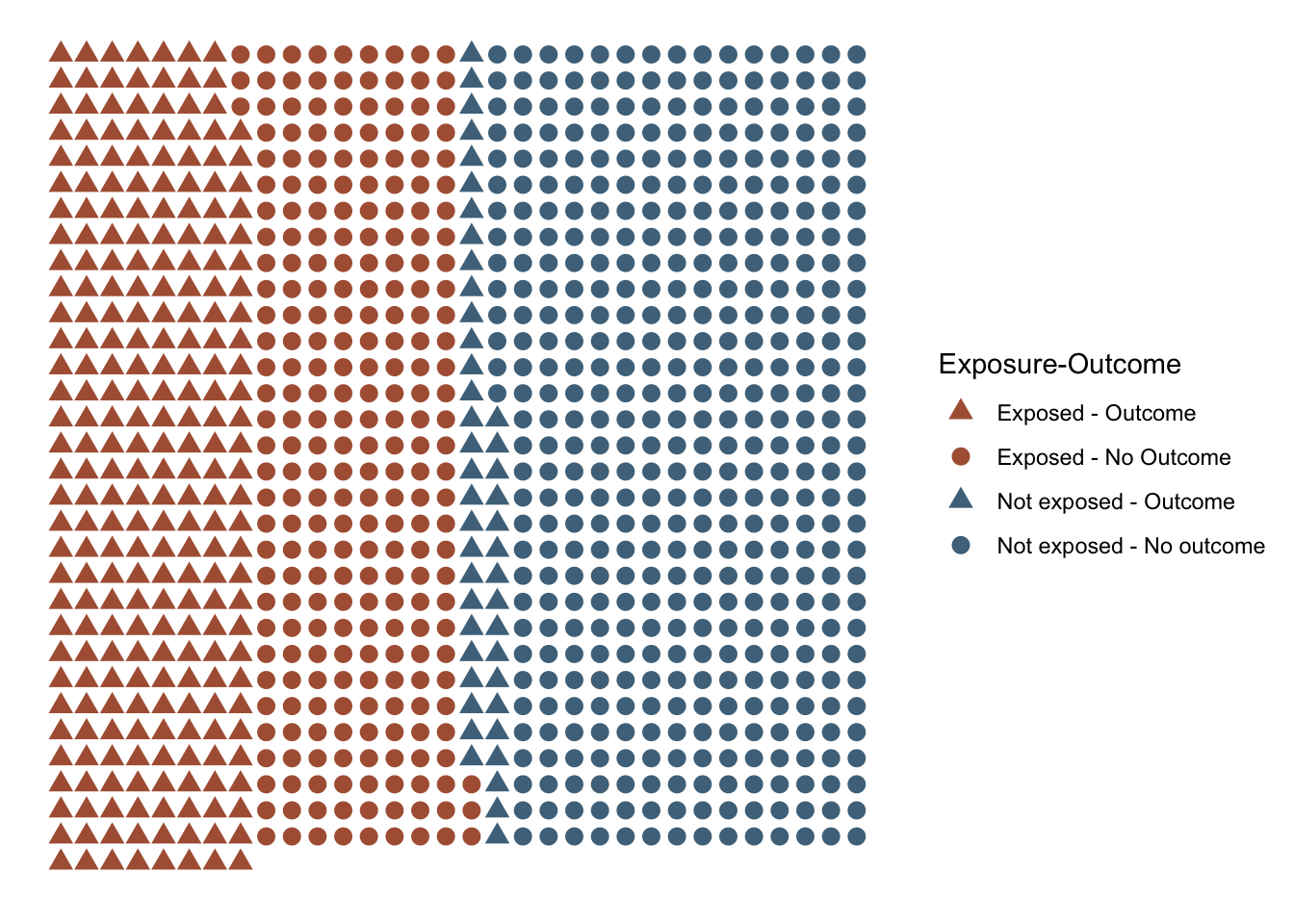
I might actually want to add this to freqtables.